WHAT’S YOUR NAME?

bartolo teaching
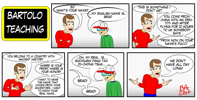
I recently worked as a Teacher with several groups of international students. I really liked this experience and inspired me with a series of brand new comic strips!

Here is the first one with me and my students.

Their age and English level vary a lot and sometimes we don’t really have a common language to use, and the communication can be a big challenge. Humor is my favorite channel to communicate with them and they like it. I like it too when they make an effort to find ways to joke with me.

I drew this comic strip using Adobe Illustrator.

NEW LOGO DESIGN

logo_fuf

This is a new logo design I did for my website about photography, Fai una Foto.

I did it in Adobe Illustrator and I wanted to create something that reminded of a camera in its most essential element, and at the same time do something more complex than the usual logos.
Nowadays simple is considered better, and I agree with that: when in doubt, following the KISS rule (Keep It Simple Stupid) is the best advise.

Experienced and talented designers have the ability to strip a concept to its most basic meaning and create something beautiful with just a few lines, recognizable in a blink of an eye from distance.

As this logo is for myself and not for a client, I wanted to try something more sophisticated: something more logo_BMWcomplex that gave the impression on a subliminal level of a strong and classic product. I am happy with this result. I had to experiment in order to reach what I wanted and I think the reason this logo gives me confidence is because it somewhat reminds me of the BMW associated to a classic and strong product. This hasn’t been done on purpose, but it offers an interesting point to think about the links and triggers of our minds.

What do you think about that?

NATURAL REFLECTION ON A SCREEN

rossana_teideRecently I went on an excursion with a friend of mine at Mount Teide (Tenerife, Canary Islands) and we took some pictures.
Now I was watching them and I decided to do a quick photo retouching, combining two of the pictures we took.
To do that I used Adobe Photoshop.

As you can see, I added a picture on my friend’s screen. This is not really difficult: I added the picture using the vanishing point solution to keep the perspective (Filter – Vanishing Point), but I think using the transform menu (Edit – Transform – Perspective) would do the job as well.roddana_teide_edited

Then adding a mask I brushed away the parts of the picture that were covered by the hand. With a bit of color correction to give some consistency you could consider the job done, but the really tricky part in this work is giving some authentic reflections on the screen.

As you can see in the first picture, there is too much light to see what the screen shows, so we see just a black screen with the reflection of her hand and the landscape. Although showing clearly her picture in the screen is bound for this effect, it should be a mistake not to add some reflections. How to do it? Very easy.

I copied the original image on a new layer and I put it on the top, then I lowered its opacity to a 30%. The majority of the picture has not been affected by it, the only change has been on the screen that I had previously modified, so it kept the original reflection!

I’VE LOST WEIGHT

i-ve_lost_weight-01Recently my inspiration comes from my conversations with my sister and I have the impression this is a well that will never run out of water.

My only problem at the moment is that I am not as fast at drawing as she is at throwing me her pearls, so at the moment I have a larger and larger waiting list of comic strips to come.

What to use them for? No idea, but I think it’s a good thing to draw them down until I’ll find a use for them at a certain point in the future.

I am drawing using Adobe Illustrator and a Wacom pen.

THE LEAVING PARTY

the_leaving_partyLiving in a place where a lot of people come an go as soon as a new opportunity comes up, meeting people that want to spend the rest of their lives here and then soon after they go is something you get used to.

A few days ago this happened to a friend of my sister and this concept all of a sudden came up into my mind. It’s been a bit embarrassing: everybody was sad for her departure, and I burst into laughs.

Anyway, I did this drawing using Adobe Illustrator.


THE POWER BLAST

SONY DSCLately I took some pictures to Romina Rossi and I have been playing around with them.

Yoga is something that fascinates me although it’s not for me. I like the idea of controlling every single muscle of the body and keep smiling while in deep pain: I SONY DSCthink it’s a good metaphor for job hunt 🙂

It is a discipline that works on the body as much as it works on the mind, in fact the most of the people I met who are interested in it share the same values (for example, they are usually vegetarian).

Yoga is a static activity where the focus is to remain still as much as you can, yet it’s a strong way to produce an incredibly powerful energy inside your body.

This is the concept I wanted to develop when I worked on this picture: while the body stays still, it produces a so powerful energy blast that the world bends.

To achieve this result in Adobe Photoshop I used the wrapping tool and masks.

MY SHORT NOVEL, GIOCHI PERICOLOSI

This is the cover I made for my new cover_giochi_pericolosishort novel, Giochi Pericolosi [Dangerous Games], available now on Amazon as an e-book and on paper.

It’s based on a true experience I had when I was at high school and as you can see from the cover, it’s about seances.

For the moment it’s just in Italian, but if you are interested in reading it, please let me know and I can have it translated into English!

To check it on Amazon, please click this link.

MY SISTER SAYS…

Too Intelligent
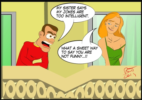
I’ve never thought about that but my sister seems to be a good inspiration for my comic strips.
I guess this is because no matter how hard I try, she seldom likes my humor and even if she tries to be nice with me, the words she uses make her thoughts obvious.

And her attempts to hide the truth of her thinking is SO obvious I am starting to find them funny. Every time she makes a comment on my strips I think This could be excellent material for a new one!
Short on comic material? Hey Sis, what do you think about this drawing? And BOOM, here we have a cool new strip!

I’m actually thinking about a series called My Sister Says 🙂

Only problem now is that I have too much material and not enough time!

WATERCOLOR WITH PHOTOSHOP

I have recently found a drawing of Ariel I did for fun a while ago and I thought it was a good idea to publish it.

06 Glen Keane Ariel06 Glen Keane Ariel_coloured

The original sketch is by artist Glen Keane, the colored version is mine.
This has been made in Photoshop. To accomplish this result I set the opacity of my brushes at a low level. This way when the flow of the same color crossed (water versus deeper water/shadow) it gave a feeling of watercolors. When two different colors crossed (like hair and water) they gave the impression of dirt color, which I think is more realistic than a perfectly colored drawing.

WHERE DOES CREATIVITY COME FROM?

The Toilet
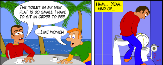
A month ago I moved to a new flat and I drew this strip out of my first impression. It’s been pretty popular among my friends.
Funny thing, now that I’m used to it, I don’t find the toilet that small anymore, and I wouldn’t find it comical enough to draw something about that.

Routine kills creativity, making new experiences boosts it.
So, likeminded creatives, if we seek new ideas we need to find ways to make new experiences.
That’s as simple as that.

MY PORTFOLIO

In this post I am uploading my portfolio 2013. cover_final
The most difficult part has been taking out works that I liked, but for some reasons didn’t really fit in this presentation.

I am sure some of you will be disappointed in not finding a sample of the project we have been working on together and I am sorry about that.
If we are still in contact, you know that I enjoyed very much working together and I hope we will work together again (if we are no longer in contact though, that could be the reason why your project is not here and your emails go directly in my spam folder).
I selected these projects to give an example of my work to whom doesn’t know me professionally.

For this portfolio I wanted to do something different and I liked the idea of designing it like an overused old fashion photo album (the reason why the cover is ripped off).

You can view the full version by CLICKING HERE.

INSPIRATIONAL YOGA 3

Bartolo Yoga3-01

This is the third comic inspired by my yoga classes.
I have others in my sleeve, but I guess you are getting the point: yoga is painful, despite what people make us believe on TV.

I draw them using Adobe Illustrator.

Here the dialogue says:

– Since I do yoga I notice more the small things like flowers and grass…
– Muscular fever?
– I wish I were dead.

INSPIRATIONAL YOGA 2

Bartolo Yoga2-01

This is the second comic strip inspired by my painful yoga classes. I usually work in English but these ones ended up being in Italian (my native language.

In this strip the character loosely inspired by me talks to a batender.

The dialogue reads:

– Today I took my first yoga class. There are some positions that make you loose your senses.

– Because of the meditation?

– Because they hurt.

I am drawing these strips with Adobe Illustrator.

INSPIRATIONAL YOGA

Bartolo Yoga
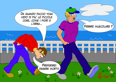
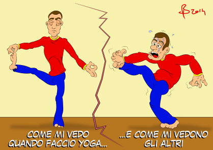
Lately I have started a yoga course that triggered my creativity.
Have you ever seen that image with a circle stating YOUR COMFORT ZONE, and then a dot far away stating HERE IS WHERE THE FUN BEGINS?
It’s actually true: doing something new (and unbelievably painful) can really help to find new ideas.

So I started drawing how painful is doing yoga, and here’s the result.
To do these comic strips I used Adobe Illustrator.

Here is this character loosely inspired by me.
The subtitle reads:

How I see myself when I do yoga
…and how others see me.

PLAY WITH THE TRANSPARENCY IN PHOTOSHOP

shultz_sottacquashultz_sirena

Lately I had fun with Photoshop turning my sister into a siren. As this picture turned unexpectedly to be quiet popular among her friends and I am currently avoiding with all my heart to start preparing my luggage (tomorrow I fly back to London) I think this is the right time for a post.

i took the guy out of the picture using a mask and the Clone Tool. Then I added a fish tail that I colored and put in perspective using the Wrap mode (Edit – Transform).

What people didn’t understand is how I kept the bubbles over the tail, and it’s actually pretty simple when you know how to do it.

After modifying the original picture make a copy and put its layer on the top, then decrease its opacity.
To blend together everything, once you are done decrease the opacity of the tail too, and the effect is done!

COLORING A JPG IN PHOTOSHOP

hornet black and whitehornet colours

Photoshop allows you to colour your drawings reaching fantastic effects, but – I was thinking – what if you have to colour a black and white jpg?

I have found on the internet this drawing of Hornet from Heroes from the North, played by Marie-Claude Bourbonnais. I don’t know the author, but if you do, I’d gladly credit him.

To get rid of the white, I changed the blending mode of the layer to MULTIPLY and I put it on the top.

Below, every layer holds a specific part of the drawing (background, shirt, skin, eyes, glasses and hair).
Each layer has 2 clipping masks, one for the shadows and one for the lights.

I used a hard brush for the flats and a very soft one for the shadows and lights.

At the end, I corrected the colours with a VIBRANCE and a HUE/SATURATION adjustment layer.

This is a pretty fast process and I like the result. Do you?


BLACK HUMOUR AND A STRIP ON MYSELF

Comic strip on Bartolo Ansaldi eating a pastry.

I’ve always been fascinated by black humour, for the guilt sensation you feel when you laugh.
This is a story on myself inspired by real life (with some obvious adjustments in the end). I like to joke about myself, and so my readers, hence I have a long tradition of true stories about myself in my Italian blog, a couple of real life animations and lately also comic strips.

To draw this strip I used Adobe Flash. It is a powerful tool to draw and I feel some of its features are even better than Illustrator (for example the ability to adjust the lines easily with the Selection Tool). The down size is that in Illustrator you have more options to personalize the lines.

This was an experiment and I have been happy with the result, even if Illustrator is the real software to use to draw comics. So I will continue to use Flash not just for my animations.

To edit the lay out I used Photoshop because I had to crop the images first (Flash didn’t cut the edges). It is true that InDesign is the real software to do that, but I find that when you have to work just on one page Photoshop is a powerful friend.

I hope you like my strip, you are welcome to give me your feedback or exchange ideas on new techniques.

WHAT’S THE BEST PICTURE? Part 2

This is another interesting example of how people perceive things in a different way. At the moment I am designing the catalogs  for the TV shows of Passion Distribution and after I make the first draft I send the title to the head of department for review.

For the TV show How Steve Jobs Changed The World I chose a frame of his speech at Stanford University in 2005 as the main picture and his most famous picture as the secondary one (left), but the Commercial Director asked me to swap them (right, and final version).

How Steve Jobs changed the WorldHow Steve Jobs Changed The World Final

The reason of my choice (left) is that the gray scale picture is an icon, is the most used picture of him in the last years (especially after his death), it became an icon that reminds me of Andy Warhol’s pop art, it has been somewhat abused and I personally feel it represents the business side of his life. That’s the reason why you have use that picture when talking about Steve Jobs.
The one in colors that I used as the main picture represents the most inspiring moment of his life: when he gave a speech at one of the most important universities in the World saying I quitted University because I felt it was useless to me, and my first thought when I see this picture is Stay hungry, stay foolish.

The Commercial Director asked me to swap the pictures because the one in gray scale is the the strongest, being the most famous.

Unlike the example in my previous post, this time I stayed with my opinion and I wanted to check what others thought. So I turned to the Marketing Coordinator (who sits close to me) and asked him which version he preferred (without knowing the background story).

He immediately picked up the version of the Commercial Director, and when I asked him to motivate his choice, he simply replied he didn’t know the other picture and the gray scale one is more powerful.

WHAT’S THE BEST PICTURE?

I am currently working at Passion Distribution (a UK TV distributor) and part of my duties involves preparing the presentations for the catalogues that will be presented shortly in Cannes at the MIPTV.

Today I had a look at some of the old titles and I have found out that in many cases, out of tens of professionally taken pictures made to promote the show, I have chosen the same pictures, in the same order, the past Designer chose.
This has made me wonder how is that possible, how come people have the same sensibility and feel in the same way what works and what doesn’t.

But it can happen also the opposite.
As I am an Italian in London and I don’t watch much TV, when it’s about choosing a picture I tend to select the one that is more meaningful to me, while English people tend to choose the smiling celebrity of the show.

I am reporting here another example of how the sensitivity of people can be different: one of the shows tells the story happened this Summers in Chile to the Miners that have been trapped in a mine.

buried_alive_chilean_mine_disasterburied_alive_chilean_mine_disaster (2)
As I think this is nowadays something that most of the people still remember very well, I chose for the main image an unrelated picture of the event, with people on the surface praying for the men trapped underground, and a picture group of the Miners underground as the secondary picture.

The Commercial Director wanted something that showed the event and captured the moment, so a picture of people working to save their lives, and ultimately we went on with her idea for the main picture.

I still like my idea better, but I respect hers and I can’t really decide which one is best. What’s your opinion?

BRISTLE BRUSH WITH ADOBE ILLUSTRATOR

I recently lost myself exploring the Live Trace options and the new Bristle Brush in Adobe Illustrator: two fantastic tools that I wanted to combine together.
This is the result: a portrait of Jennifer Aniston that looks like an oil painting. Thoughts?
Jennifer Aniston

To do that I traced twice a picture of Jennifer Aniston with the Live Trace tool.
The first time I did it in colors, the second time in black and white and I took out the white leaving transparent instead. This made the edges of the picture stronger.
In the next layers I painted the picture using a variety of Bristle Brushes, the first time doing the flats, on the next layer taking care of the lights, then the shadows, the details and the hair.

I didn’t expect a so realistic effect. I like it. And you?

MARIO MONTI “WHO INSULTS ME ON FACEBOOK WILL BE PROSECUTED”

Monti Minaccia FacebookIt can be tricky to explain to a non-Italian what a Technical Government is, but basically in November 20011 our Government acknowledged that things were so messy in my Country and Politician had no clue on what to do, so they asked someone who was supposed to be smarter to clean up what they did, so that they could come back and mess up again.

That person is Mario Monti, chief of our Government of Technicians.

But he started liking to be there, and after a year he decided to run for the elections, although he doesn’t know much about gaining the trust of the people.
Because even if he has been considered great by our politicians for doing their dirty job, many Italians (yours faithful included) didn’t like him at all because he just raised taxes and did whatever Germany asked him to.

So when he opened his account on Facebook he was initially flabbergasted by the tens of thousands people who liked his page, just lately understanding that the most of them did it to tell what they thought about him.
In a few days he skipped from enthusiasm to hanger and threats to prosecute anyone who will offend in on Facebook, and I immediately thought his status deserved a drawing of me suggesting all the readers to tell him GENTLY to @@@@ off.

To realize this drawing in Adobe Illustrator I first sketched myself using a customized PAINTBRUSH TOOL, then in another layer below that one I colored the illustration using the BLOB BRUSH TOOL.
For the shadowing I duplicated the color layer putting the shadow layer between the other two and  I darkened all the tints. Then with the ERASER TOOL I took out the portions I didn’t want, leaving the shadows.

I like this technique very much.

For the monitor, I made a PRINT SCREEN of Monti’s page and then I applied over the JPG a clipping mask the shape of the monitor.

PHOTOSHOP HEAVY RETOUCHMENT

gabriel_curringtonLately I have seen a really bad photo retouchment of Prince William on the cover of Hello magazine. Apparently, the fact that he is becoming bald is a great deal in UK.

After my initial shock, I started to think how I would do in case of a heavy photo retouchment that doesn’t have to look realistic, nor that awful.

So I picked a picture of my friend, British Film Composer Gabriel Currington, to make a test, and I treated the original picture like a drawing, instead of using the usual tools.

Honestly, he didn’t like the result. I still have to make up my mind. It’s obviously a photoshopped picture, but it’s different from the usual Photoshop jobs that try to cheat on being real, so I don’t mind it.

gabriel_currington_modified2To achieve this result I redrew his face using different sizes of paint brushes, playing with their hardness and opacity. After painting his face in a new layer using a flat color for the base, in each additional layer I focused my attention on the lights and shadows, using the techniques I use to ink my illustrations.

I redrew his eyes giving more lights and reflections.
Notice also how I redrew his jaw. In my version the shape of his jaw looks more unnatural, but I find it accentuates his manhood.

Lastly, I retouched his hair painting over it the wall and the monitor. That gave it a more pleasant shape.

CONGRATULATIONS MR. PRESIDENT!

Recently I have seen a picture of President Obama and his wife hugging after winning the elections. I liked it so much decided to make this drawing out of it.
I wanted to congratulate him anyway 🙂
congratulations_mr_president

To do that, I sketched it in Illustrator, then I did all the coloring and shadowing in Photoshop.

For the sky I used an interesting effect on Photoshop: select the colors for the foreground and background, go to Filter – Render – Clouds and it automatically does this effect.

Then you can change it going to Filter – Render – Difference Clouds.

YOU CAN CHANGE YOUR GENES, by MELANZANE AL CIOCCOLATO

I would like to thank the site Melanzane al Cioccolato for having published my drawing.
If you speak Italian and are interested in a healthy life style, this is a site that I definitely recommend you to visit often.

Usually families with eating disorders have more than one member overweight, and people generally tend to think this is related to bad genes.
In this article they suggest to take a look to your pet animal. If your cat or dog is a bit too fat too, it is very likely that you should review your eating habits first.

I sketched this drawing on paper, I traced it on Adobe Illustrator and colored the flats, then in Adobe Photoshop I did all the lightening and the shading.

For the ones that noticed a familiarity on the picture behind the family, you’re right! I am a Simpsons fan and this is a homage 🙂

POLICE AGAINST THE STUDENTS

Lately there have been student demonstrations in my Country, Italy, and I have been astonished to know that police have beaten up students protesting over the corruption of our politicians.
It is even more astonishing to notice how two days later nobody talks about it anymore on Facebook.
I think when you have a strong interest in visual arts and communications it is your duty to do as much as you can to spread the word on topics that are important to you, and this is why I did this drawing.

The writing says To protect the Corrupts from the Helpless.
I did this drawing in Adobe Illustrator.

For the shadowing I used the blob brush, adding a blur effect to simulate the visual effect you have in Photoshop, but with the advantage to keep working on vectors.

THE MUMMY

This is a Mummy I drew for Halloween, then I forgot to post it. Can you believe that?

I drew it in Illustrator dividing it in 4 pieces (head, costume, hand and background) and making 3 versions of each element.

Then I combined the elements in multiple order to have random mummies.

It has been an interesting experiment, it would have been nice to have these mummies here 2 weeks ago!